Showing posts with label Graphs. Show all posts

Thursday, May 8, 2014

Deforestation Causes


Figure 1: Causes of Deforestation from 2000 to 2005
Figure Source:https://blogger.googleusercontent.com/img/b/R29vZ2xl/AVvXsEhdbnjzS2xNCYK3WLs323-rECfmdogd6WNbOIaAi7-P-JVA6laQEc0vglpNqlekBbN_R_5oRTxXm249jj8i6hwnjkFYBffU97CYoaSyzhnyQf_ewwwVSPuVa7lVXZ5l4QfLMVXuoCguKPZ4/s400/Causes_of_deforestation_chart.jpg
A few times in my Climate Change course my professor mentioned that much of the deforestation being done was for the purpose of cattle farming and soy production for cheap beef. It's amazing to see how much of deforestation is really being causes by the need for cattle ranches. All of the other causes combined are barely over half of that single cause.

Sea Level Rise

Figure 1: Sea Level Rise
Figure Source: http://www.nasa.gov/images/content/121630main_slr_thermal.jpg
This graph shows how in just the past 50 years sea level has risen over 20mm. While that doesn't seem like too much, it appears to be increasing more rapidly and will continue to as the Earth's temperature continues to rise. With rising sea level, coastal towns and cities are at risk for flooding, which can have detrimental damage and cause massive evacuations of cities. Many cities already have plans (look back at my post about Massachusetts's Plan) for rapid sea level rise that include adaptations and mitigation strategies. If you live near the coast, check out if your state has a plan!

Climate Change Survey Poster

For my Climate Change course, we surveyed students and faculty about climate change. In groups we then analyzed the data collected and presented at the UMass Undergraduate Research Conference in April. My group presented on the data that was collected around the opinions of the people surveyed. We created a poster to present this data, in relation to similar data that Yale collected a few years ago when they created the Six Americas or categories of concern and thinking around climate change.
Here is a link to our poster!

Weather Fatalities

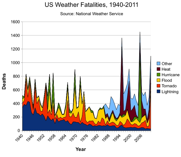
Figure 1: Weather Fatalities from 1940 to 2011
Figure Source: http://www.statschat.org.nz/wp-content/uploads/2012/10/weatherfatalities1.jpg
This figure shows weather related fatalities over the past century. As you can see there has been start increases over the past few decades relating to heat and hurricane related natural disasters. With climate change comes an increase in extreme weather. Global warming and climate change are on the rise, and it is likely that we will experience more extreme natural disasters such as flooding, hurricanes, tornadoes, and extreme heat. With these disasters comes increased risk of death. I think that over the next few decades (and probably longer) we will see spikes in deaths, such as is illustrated on this graph.

Monday, May 5, 2014

Is the Sun to blame? NO!

Throughout our class we discussed a lot about what factors influenced the Earth's recent warming. Climate change skeptics have laid blame on the Sun, saying that the Sun is changing or is closer or is getting warmer. It does happen, the Earth and the Sun are not at a fixed distance, and the Sun can change in intensity, but global warming is not happening just because of the Sun. As you can see in the figure below, the Sun has a natural pattern of rising and falling intensity, but the warming we've been experiencing is attributed to other causes (cough cough, humans). While the warming of the Earth appears to be following the warming of the Sun, our warming continues to shoot up at a rapid rate, while the Sun falls back into its natural cycle.
Figure 1: Surface Temperature versus the Sun's Output
Figure Source: http://www1.ncdc.noaa.gov/pub/data/cmb/images/indicators/solar-variability.gif
This figure compares the Sun's cycle to the rapid increase in the Earth's global temperature.

Tuesday, March 4, 2014

Ice Albedo Feedback

The ice-albedo-feedback is quite simple, but very serious. Snow and ice reflect the sun which means that they do not absorb much of the solar radiation, they have a high albedo. The water around the snow and ice is much darker, absorbing more of the Sun's radiation (a low albedo), causing the water to heat up. This heating then melts the snow and ice, exposing more of the water, absorbing more of the sun and heating more, and so on. The more water is exposed, the more heat it absorbs. The more heat it absorbs, the more the ice melts exposing more water.


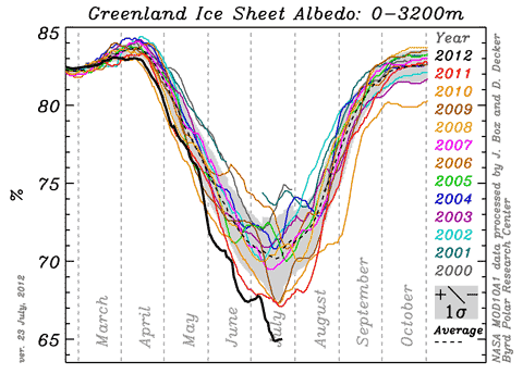
Figure 1: Ice Sheet Albedo
Image Source: http://hot-topic.co.nz/wp-content/uploads/2012/07/GISalbedo201207.png

You can see in this figure how the albedo, ability to reflect sunlight, decreases into the summer months of the Northern Hemisphere (May - August) and then increases into the fall and winter months. This illustrates how as the temperature increases and ice melts, more radiation and heat is absorbed, melting the ice, and so on. 

Ice Cores

Because ice cores clearly show different layers of ice, dust, volcanic ash, etc, years and seasons are clearly distinguishable. This means that scientists can zero in on different years fairly easily and analyze what was happening during that time. Ice cores reveal atmospheric circulation patterns, because they show dust, volcanic ash, salts, etc. This means that scientists can analyze what they find in the ice cores in order to see what was happening but also why. They are able to determine wind strengths and pressure centers from the concentration of dust, ash, salt, etc. Ice cores also hold information about carbon dioxide concentrations. From the concentration of carbon dioxide in a particular part of the ice core, scientists can determine if that part of the Earth was experiencing a glacial or interglacial period because lower concentrations correlate with colder temperatures and visa versa.


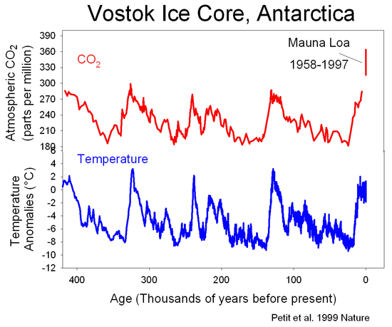
Figure 1: Ice Core Data
Image Source: http://joannenova.com.au/globalwarming/graphs/ice-cores/vostok-ice-core-petit-web.gif

This figure shows the relationship between carbon dioxide concentrations found in ice cores in Antarctica as well as the temperatures. Seeing this correlation, scientists can now further relate lower concentrations with colder temperatures and high concentrations of carbon dioxide with high temperatures. 

Tuesday, February 25, 2014

Jeff Tollefson

Jeff Tollefson is a reporter and writer for Nature, a weekly science journal. He has previously worked for Congressional Quarterly as well as the Billings Gazette. He has won many accolades as a science reporter. As far as reliability goes, I would say that I trust a scientific journal but am skeptical because he is not a scientist. After reading one of his articles, "The Case of the Missing Heat" I have to say that I'm not persuaded to thinking that we are not experiencing global warming. Although he claims that skeptics as well as scientists are convinced that they previously overestimated the severity of the effects of greenhouse gases, I think he and those supposed people are focusing too too short term. While he appears to make valid points, it is my opinion that he is further illustrates the "skeptic" view of global warming that is shown on the figure below.


Figure 1: Skeptics and Realists Views of Global Warming
Image Source: http://www.jimharris.com/wp-content/uploads/2012/02/skepticsvrealists_500.gif

Saturday, February 22, 2014

Montreal vs Kyoto Protocols

Montreal Protocol:
The Montreal Protocol was a worldwide agreement set in 1987, where all participating countries agreed to lessen their output of harmful chlorofluorocarbons and bromocarbons over the following 20 years. The original agreement had countries cutting their production down to half, but after a revisions in 1990 and 1992 the new goal was to completely cut off all production of those harmful gases. The reduction has averted about 10 gigatonnes of carbon dioxide equivalent per year since.

Kyoto Protocol:
Similar to the Montreal Protocol, the Kyoto Protocol was a global agreement to cut down carbon dioxide (and other greenhouse gas) emissions. The plan called for a reduction of about 2 gigatonnes per year.

Although each protocol cause reductions in the emissions of harmful greenhouse gases, the Montreal Protocol resulted in approximately five times as much. The Montreal Protocol also has been implemented longer than the Kyoto Protocol, giving it more time to create results. Although there are still harmful CFC’s and other gases in the atmosphere that have yet to break down and disappear completely, the Montreal Protocol has been more efficient in its efforts to help protect the ozone.


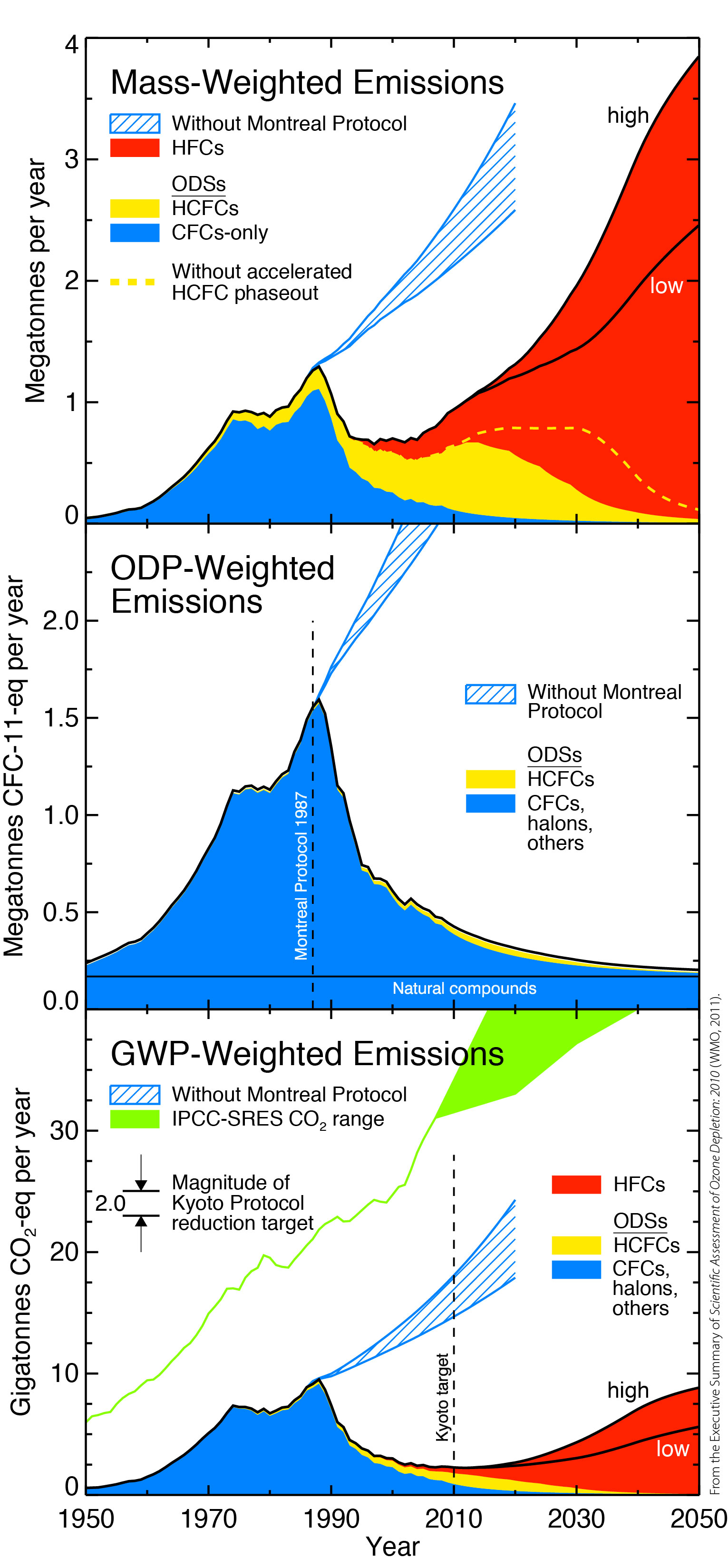
Figure 1. Megatonnes per Year

Source: http://www.esrl.noaa.gov

This image clearly shows the differences between the impact of the Montreal Protocol (middle graph) and the Kyoto Protocol (bottom graph). The Montreal Protocol shows major drops in the CFC's, ODS's, and other gases over the course of 20 years. The Kyoto Protocol shows some drop but it is gradual and minor. As illustrated in all three graphs by the blue stripped path that without the Montreal Protocol our production of these harmful gases would have dramatically increased. 

Friday, February 21, 2014

Graph Widget

Global Climate Graph

This graph shows the relation between the Sun's output, Carbon Dioxide concentrations, and Global temperatures since 1990. You can see that while the Sun's output has remained fairly consistent, the rise in Carbon Dioxide coincides with the rise in temperatures.
What do you think about this graph?
If you'd like to play around with it for yourself visit the website here!

Wednesday, February 12, 2014

Power Related Deaths


Image Source: http://www.newscientist.com/data/images/archive/2805/28053601.jpg

This image is very powerful in that it shows you side by side the deaths (recorded) of these power sources. A huge worry for many people related to Nuclear energy is that it could have devastating deaths if something went wrong. This graph shows, even with Chernobyl, the numbers are vastly below Coal. The other thing to keep in mind when looking at this is that, those deaths related to Nuclear power were most all accidents and unfortunate events where as with Coal, nothing went wrong, there were no Coal plant disasters. The deaths related to coal come mainly from air pollution. So when thinking about Nuclear vs. Coal, remember that Nuclear may not be as dangerous as you think and even still, it's less dangerous than Coal already is. 

Air Pollution Related Deaths


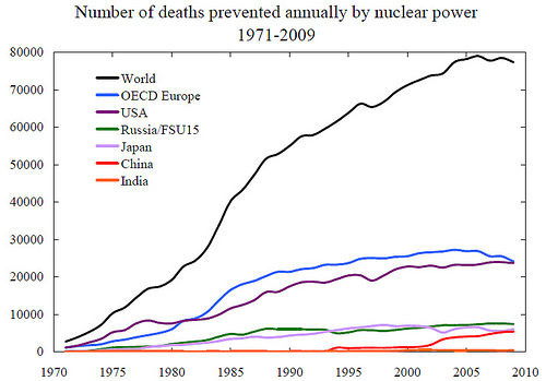
Image Source : http://math.ucr.edu/home/baez/ecological/nuclear_power_hansen.jpg

This graph shows shows how many deaths, approximate, have been prevented by nuclear power. These numbers are in relation to air pollution. Coal gives off enormous amounts of carbon which highly pollutes the air we breathe. As this graph illustrates, thousands of people could have potentially died (on top of others who unfortunately did pass because of air pollution) because of the pollution caused by burning coal.