Image 1: Global Warming Hoax?
Image Source: https://www.youtube.com/watch?v=9h7P8gWpolQ
This cartoon illustrates how although the signs of global warming are there (besides the fact that we know climate change is real!) there are still people denying that it's happening. Especially after the cold winter we had this year and the polar vortex, there are a lot of people who are trying to say that global warming is no more and the Earth's temperature is declining!
Showing posts with label Images. Show all posts
Thursday, May 8, 2014
Deforestation Causes
Figure 1: Causes of Deforestation from 2000 to 2005
Figure Source:https://blogger.googleusercontent.com/img/b/R29vZ2xl/AVvXsEhdbnjzS2xNCYK3WLs323-rECfmdogd6WNbOIaAi7-P-JVA6laQEc0vglpNqlekBbN_R_5oRTxXm249jj8i6hwnjkFYBffU97CYoaSyzhnyQf_ewwwVSPuVa7lVXZ5l4QfLMVXuoCguKPZ4/s400/Causes_of_deforestation_chart.jpg
A few times in my Climate Change course my professor mentioned that much of the deforestation being done was for the purpose of cattle farming and soy production for cheap beef. It's amazing to see how much of deforestation is really being causes by the need for cattle ranches. All of the other causes combined are barely over half of that single cause.
Comparison of Resources
Image 1: Comparison of Resources
Image Source: http://i234.photobucket.com/albums/ee274/biopact3/biopact_EU_energy-technologies.jpg?t=1195856315
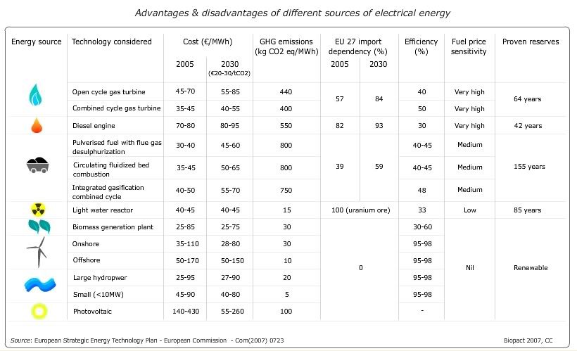
I like this chart because it breaks down different renewable and nonrenewable resources and shows costs, import dependency, efficiency, and reserves: all important aspects to consider! It's interesting to see such low numbers for proven resources, but also scary because some of those are within my lifetime! It's also interesting to see the efficiencies. I wonder how they determine that efficiency and if those comparisons relate to the size, costs, or what? I don't know, it's just a thought so if you have any ideas let me know!
Image Source: http://i234.photobucket.com/albums/ee274/biopact3/biopact_EU_energy-technologies.jpg?t=1195856315
I like this chart because it breaks down different renewable and nonrenewable resources and shows costs, import dependency, efficiency, and reserves: all important aspects to consider! It's interesting to see such low numbers for proven resources, but also scary because some of those are within my lifetime! It's also interesting to see the efficiencies. I wonder how they determine that efficiency and if those comparisons relate to the size, costs, or what? I don't know, it's just a thought so if you have any ideas let me know!
Worldmapper
Worldmapper is a cool website that has almost 700 maps! Each map is shaped according to the data that it is about, so each map looks distorted according to the subject. You can find maps on population, food, income, births/deaths, education, resources, violence, etc. It’s organized by category for easy browsing! An example below shows use of coal power rates across the globe. You can see how this world map does not quite resemble the normal world map, rather it's resized to fit the data!
Image 1: Coal Power
Image Source: http://www.worldmapper.org/images/largepng/113.png
This map shows the use of coal for power across the globe. You can see how the U.S. and China are leaders in this, while most of South America does not use coal or uses very little.
Image Source: http://www.worldmapper.org/images/largepng/113.png
This map shows the use of coal for power across the globe. You can see how the U.S. and China are leaders in this, while most of South America does not use coal or uses very little.
We need change fast!
Image source: http://www.cagle.com/tag/emissions/page/9/
I think this cartoon really illustrates how climate change is a powerful force that has crept up on us (while we debate if it's really happening or not, which it is!) and how slow we are to be doing something about it. Now that we have decided (at the government level at least) that climate change is happening, we have to do something about it. The IPCC released new reports, states and countries are creating plans, but some of those plans are very vague and/or long term. I know that it can take time for projects to be put into action and then new structures build and kicked into gear. But that's why we need to start making decisions on what kind of renewable energy structure we're going to build now! Otherwise we're going to be swept way by climate change.
Sunday, May 4, 2014
Political Cartoon
Figure 1: Political Cartoon
Figure Source: http://www.personal.psu.edu/afr3/blogs/SIOW/climate-change-science-v-politics-cartoon.jpg
I found this cartoon and paused at it for a moment, to figure out what I thought it meant. I decided that it can be interpreted in two different ways (if you think of another let me know!). I think at first glance, it appears to be bashing politicians for not listening to scientists. It clearly depicts scientists with facts and politicians with opinions. After I thought about it for a little while, I thought of another interpretation. I thought that it could be a comment on the lack of communication between climate scientists and politicians on the topic of climate change. We know that climate change is happening and we know that we have to do something about it. Now. But there is a large amount of grey area in that we do not know what to do and how to go about deciding all that. So interpret the image as you may, but keep these thoughts in mind!
Friday, March 28, 2014
Frozen Niagara Falls
As you might imagine, the freezing of this massive amount of water doesn't happen often! With that much force, it would take a lot of cold. Since we've been experiencing a polar vortex, cold is not something the Northeast is lacking. To see more photos and a video about the more current freezing click here!
Figure 1: Niagara Falls in 1911
Image Source: http://static.panoramio.com/photos/large/45313585.jpg
This image shows Niagara Falls in 1911, when it became partially frozen due to the extreme cold temperatures.
Figure 2: Niagara Falls in 2014
Image Source: http://s1.ibtimes.com/sites/www.ibtimes.com/files/styles/v2_article_large/public/2014/01/09/niagara-falls_3.jpg
This image shows the Falls, this past January, 2014, when it partially froze.
Tuesday, March 4, 2014
Ocean Sediments Profile
Here I have created a mock dating profile for Ocean Sediments. In includes a little bit about ocean sediments as well as it's strengths, weaknesses, "goal" as well as two figures.
Friday, February 21, 2014
Climate Bathtub Model
The Climate Bathtub Model is a great way of showing the different kinds of scenarios that we have and could experience related to global warming. In this analogy by John D. Sterman and Linda Booth Sweeney, the bathtub itself acts as the Earth’s atmosphere. The water flowing into the tub from the faucet, represents the carbon dioxide that is being added to the atmosphere, while the water leaving the drain represents the carbon dioxide leaving our atmosphere. Therefore the water left in the tub is the carbon dioxide that remains in our atmosphere. Through the different models you can see how increasing the inflow causes the amount of water in the tub, or carbon dioxide in our atmosphere, to increase quite fast. On the contrary, increasing the outflow would cause a rapid decrease in the carbon dioxide in our atmosphere.
By using this kind of model we can make predictions about the future by experimenting with the inflow and outflow speed, size, etc. Our goal would be to have the carbon dioxide that is being emitted into our atmosphere (from nature as well as human influence) equal the amount of carbon dioxide leaving the atmosphere: equilibrium. This model is able to show us that, as previously stated, an increase in the water going into the tub, carbon dioxide emitted into the atmosphere, that the tub will fill and eventually overflow.
Wednesday, February 12, 2014
Power Related Deaths
Image Source: http://www.newscientist.com/data/images/archive/2805/28053601.jpg
This image is very powerful in that it shows you side by side the deaths (recorded) of these power sources. A huge worry for many people related to Nuclear energy is that it could have devastating deaths if something went wrong. This graph shows, even with Chernobyl, the numbers are vastly below Coal. The other thing to keep in mind when looking at this is that, those deaths related to Nuclear power were most all accidents and unfortunate events where as with Coal, nothing went wrong, there were no Coal plant disasters. The deaths related to coal come mainly from air pollution. So when thinking about Nuclear vs. Coal, remember that Nuclear may not be as dangerous as you think and even still, it's less dangerous than Coal already is.
Air Pollution Related Deaths
Image Source : http://math.ucr.edu/home/baez/ecological/nuclear_power_hansen.jpg
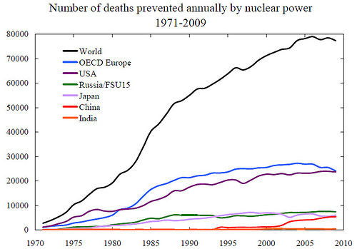
This graph shows shows how many deaths, approximate, have been prevented by nuclear power. These numbers are in relation to air pollution. Coal gives off enormous amounts of carbon which highly pollutes the air we breathe. As this graph illustrates, thousands of people could have potentially died (on top of others who unfortunately did pass because of air pollution) because of the pollution caused by burning coal.
Decision Board: Build a Nuclear Plant?
YES
|
NO
| |
No Nuclear Accident
|
|
|
Nuclear Accident
|
|
|
Monday, February 10, 2014
Stop Climate Change Poster
Before It Changes You!
This image that WWF created struck me because it makes climate change personal. There are many images and posters and organizations that are advocating for an end to climate change so that we have a better planet. We've all seen cartoons and pictures of green hills and blue skies versus brown landscape and smokey skies, but this (as dramatic as it may be) brings climate change to a very personal level. This kind of image as a scare tactic may just be the thing that people need to see in order to get them thinking more proactively about what they can do to help in our battle with climate change.
Sunday, February 9, 2014
Nuclear Power
Advantage vs Disadvantage
This simple illustration picked one advantage and one disadvantage (arguably the most positive: having electricity. And most negative: radioactive waste) and placed them side by side. It is interesting to me because the disadvantage portrays a hand reaching out of an overflowing barrel of neon green waste. In reality, there will not be open containers of waste laying around for people to fall into, but the symbolism strikes hard. It makes you wonder, where will this waste be stored? How much would be produced? Is it ensured that it will not harm us by just existing? Large questions from such a small and simple picture.
What thoughts or questions strike you as you after looking at it?
Image Source: http://www.buzzle.com/img/articleImages/218911-14320-50.jpg
Saturday, February 1, 2014
Status Quo
The status quo is a barrier, like a giant boulder on a hill that, although slowly changes over time (slowly gets pushed up the hill) muffles the voices and ideas of those who want that change now. The person on the upside of the boulder/status quo represents the "norm" of societies current views. While the person on the low side of the boulder is fighting to push the status quo while society or the man on higher ground, is holding them back because they currently have the upper hand.
Image Source: http://graphics8.nytimes.com/images/2012/02/22/opinion/22status-quo-toon/22status-quo-toon-blog480.jpg
Subscribe to:
Posts (Atom)